
County Health Mapper
Free Public Health Mapping Tool
Screenshots
Free
Data Science
Health
Healthcare
Built with Javascript
 Html5
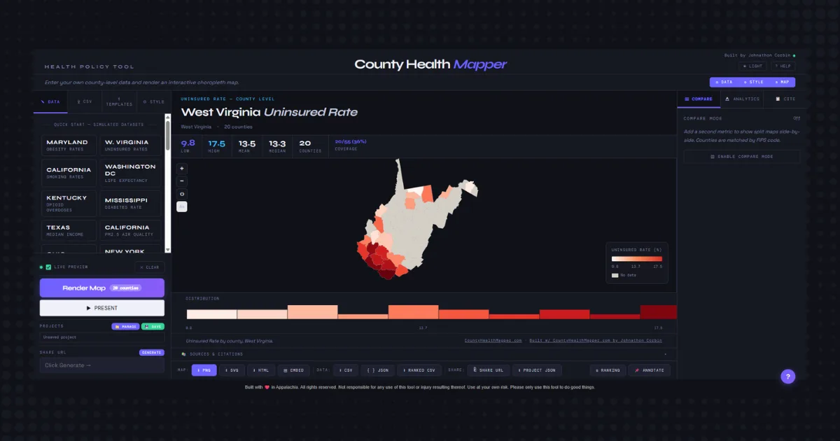
JavascriptHtml5County Health Mapper is a powerful, browser-based application designed specifically for public health professionals, researchers, and data storytellers. It enables users to easily input county-level public health data, identified by FIPS codes, and transform it into highly interactive and visually compelling choropleth maps.
The core functionality revolves around creating dynamic maps that visually represent the distribution of public health metrics across counties. Users can input their specific data, such as disease rates, vaccination percentages, or socioeconomic indicators, and see them rendered on a map with customizable color scales. This visual representation is crucial for identifying geographic patterns, hotspots, and disparities.
Key features of County Health Mapper include:
- Interactive Choropleth Maps: Generate visually rich maps where each county is shaded based on the data value.
- Tooltips: Hover over any county to see detailed information and specific data points.
- Legends: Understand the color scaling and data ranges with clear, informative legends.
- Rankings: Easily see how counties rank against each other based on the input metrics.
- Exports: Save your maps and data in various formats for reports, presentations, or further analysis.
- Shareable Views: Create and share unique URLs that link directly to your generated map and data configuration.
- Configurable Color Scales: Customize the color schemes to best represent your data and meet accessibility standards.
This tool is ideal for anyone involved in hospital and/or public health analysis, planning, and communication. It solves the problem of making complex, geographically dispersed data accessible and understandable. The main benefits include enhanced data visualization, improved identification of health trends and inequalities, simplified data reporting, and more effective storytelling with public health data.
Loading...


















 Prev
 Next