



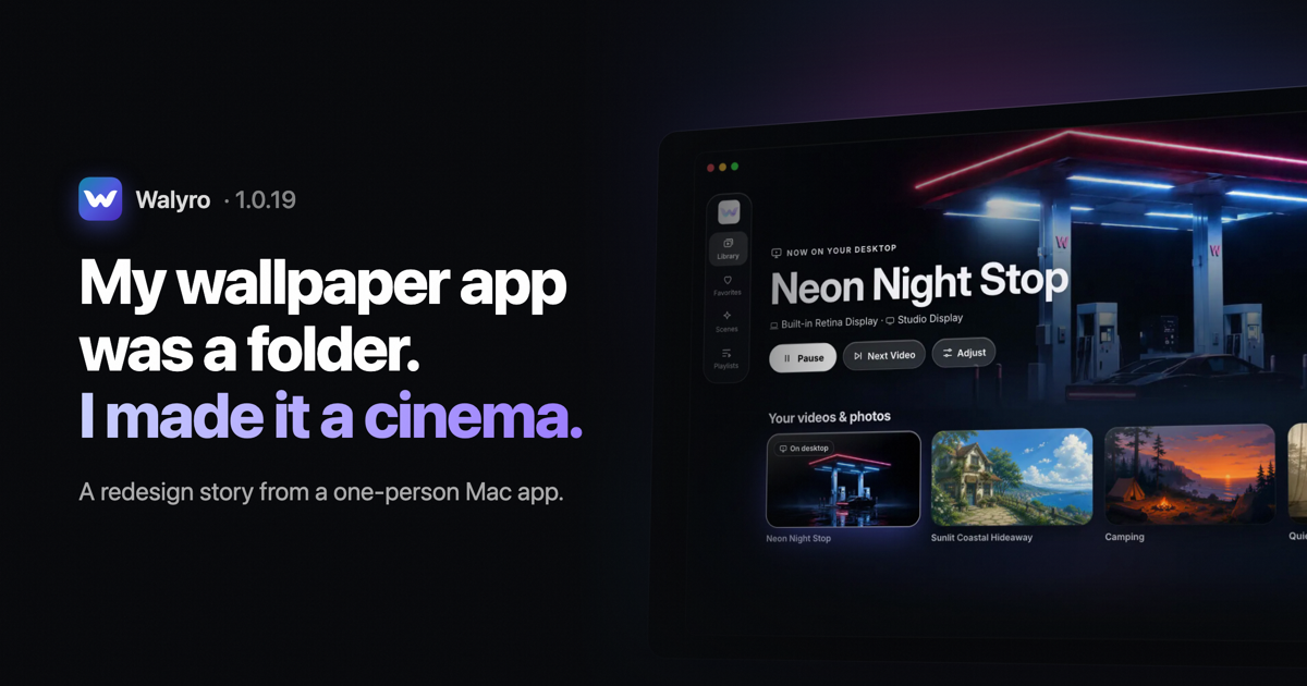
I make Walyro on my own. It's a Mac app that turns your own videos, photos and animated Scenes into a live wallpaper.
For a long time the main window was a grid of thumbnails with a sidebar. It worked: you picked a file, clicked Set, closed the window. And that was the problem I kept coming back to. The app looked like a folder, so people used it like one. Set a wallpaper once, never open the app again.
A wallpaper you stop noticing isn't doing much. I wanted Walyro to be something you open just to look at, and change when your mood changes. Streaming apps already solved "here's a pile of videos, pick one for tonight", so 1.0.19 borrows their layout.
Start with what's already playing
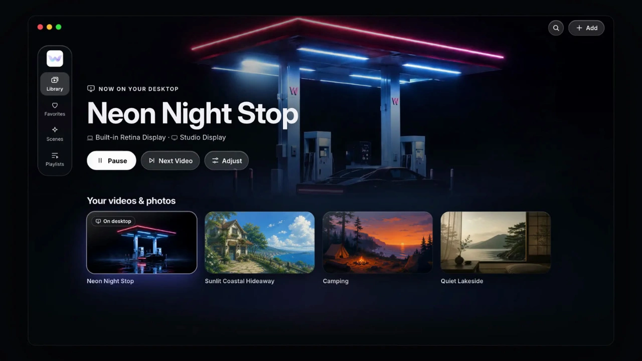
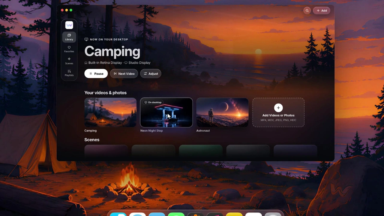
The old window opened on your files. The new one opens on your desktop. The wallpaper that's playing right now fills the top of the window, with its name, the displays it's on, and three buttons: Pause, Next Video and Adjust. Most of the time that's all you came for, so it's the first thing you see.
Let people try a wallpaper on
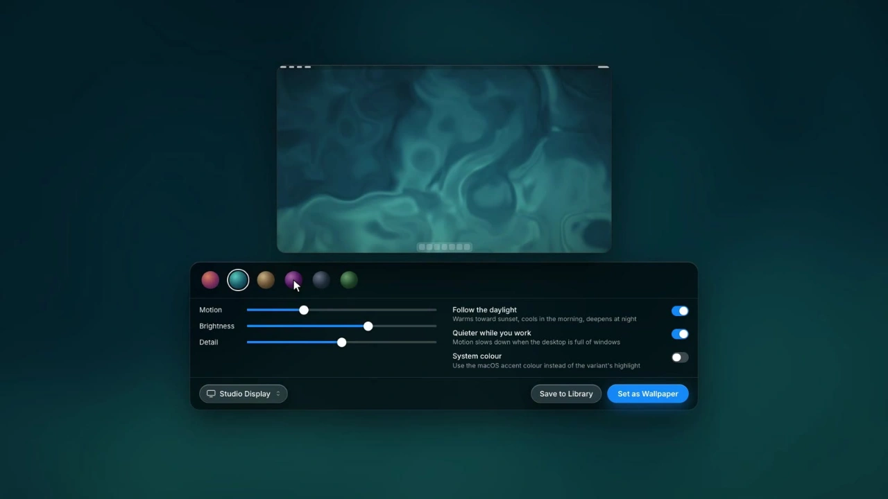
Hovering a card to preview it isn't new in Walyro. What's new is the click: the video or Scene opens framed at your display's exact shape. A clip that looks great as a wide thumbnail can lose a face or the horizon on a MacBook screen or an ultrawide monitor. Now you see the real crop before you press Set as Wallpaper, not after. For a Scene, the same screen holds its colours and pace, so you tune it while you watch it.
Shelves instead of a grid
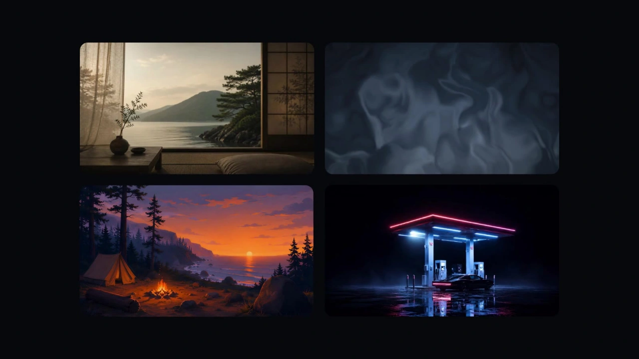
Your videos sit in rows of wide cards, newest first, so whatever you just added waits at the front. Drop a few files on the window and they land there. Scenes and playlists get rows of their own, and Search sits in the top corner for when the library gets big. A small rail on the left replaces the sidebar: Library, Favorites, Scenes, Playlists.
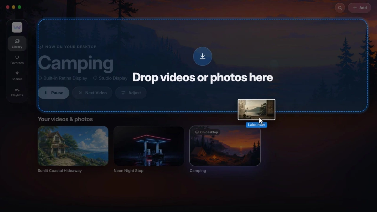
The window is dark now. Videos look better on a dark ground, and the colours of the current wallpaper bleed softly into the background, so the window changes with whatever you're playing.
Two screens, two playlists
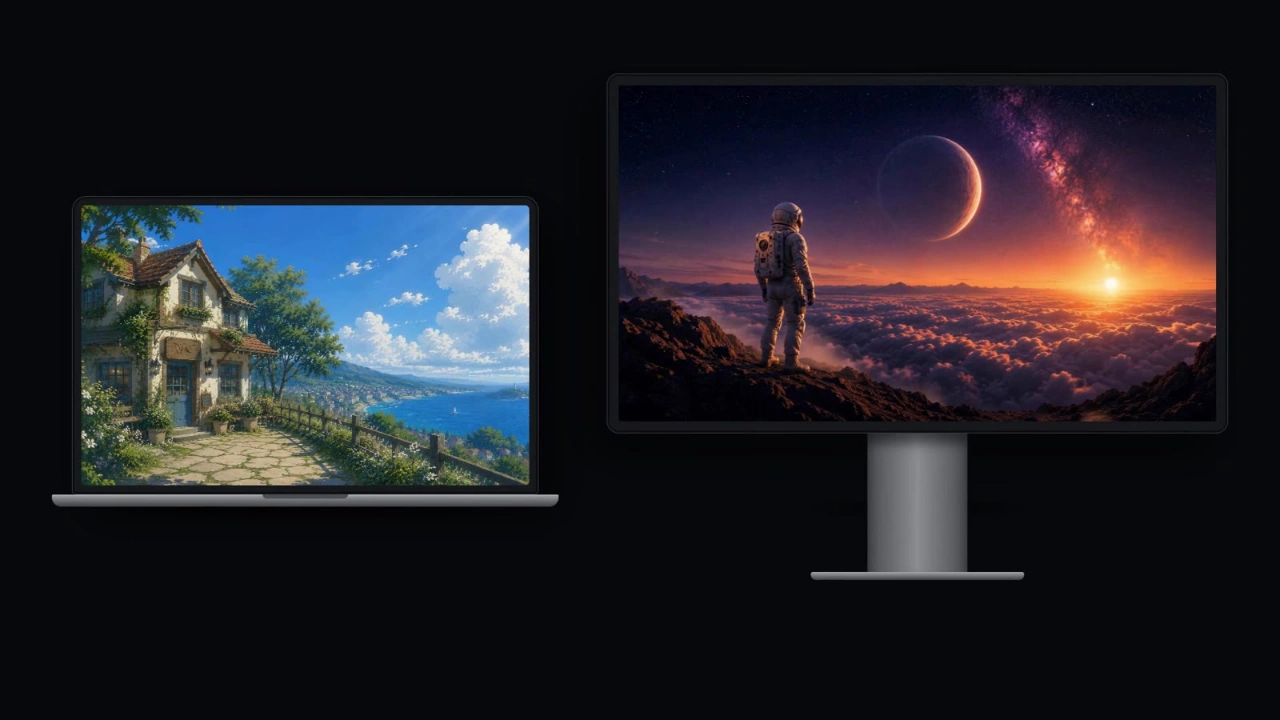
If you have a second display, each screen can now run its own playlist. I also added "End of video" as a timing option, so every clip plays to the end before the next one starts instead of cutting off at a fixed interval. There's a longer write-up on live wallpapers across several monitors if that's your setup.
What I didn't touch
A redesign is an easy way to break things people already rely on, so I drew the line before I started. Onboarding, the purchase flow and the menu bar controls stayed as they were. Your library, playlists and settings carry over without you doing anything. The new window runs on macOS Sonoma and later, and picks up Apple's glass look on macOS Tahoe.
What I'd tell another indie dev
Build the first screen around the question people open your app with. For a wallpaper app that's "what's on my desktop?", not "where are my files?"
Show the result before the commitment. Previewing at the real screen shape cuts out the set, look, undo loop.
Decide what stays the same before you redesign anything, and hold to it. That's what kept a full redesign small enough for one person to ship.
Walyro is on the Mac App Store. It's free to start, and a one-time purchase lifts the free plan's limits on your own videos and photos. Everything that changed in this version is in the 1.0.19 release notes.